Ask any manager in charge of implementing a new technique or system, and they will tell you that the most nerve-racking component of a project is determining whether or not employees will accept the new tools. Without a doubt, user experience/UX design makes a significant impact.
In this post, we’ll look at why you should develop a people-centric approach to finance digitisation and how we did this when we gave our app a makeover.
The benefits of digitization
Digitizing finance has a huge number of benefits including increased efficiency, reduced error rate and better reporting & insight. Still many finance leaders are reluctant to start the transformation process.
One of the reasons for this is that implementing new systems is perceived as a risk. People worry that much of the potential benefits are lost if users do not adopt the new technology.
Academic research shows that systems with an enjoyable user experience have increased hours of usage, a higher willingness to recommend, and a higher likelihood of continued use.
So if finance leaders want to enjoy the benefits of finance digitization then it makes sense to ensure that the end-users have the best experience with the systems and that starts with a people-centric User Interface (UI).
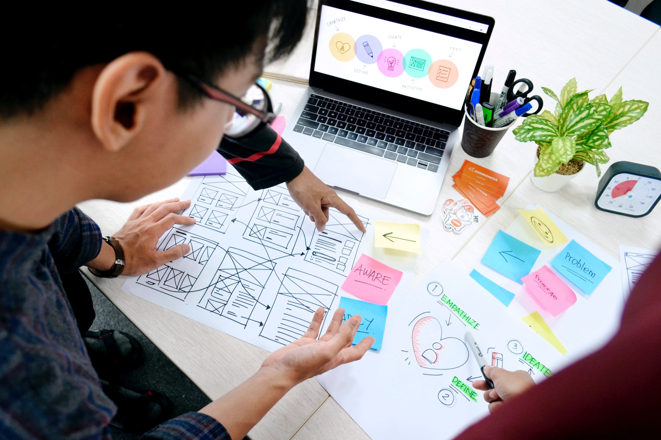
What is ‘user centricity’?
User centricity means putting the person or customer at the heart of any development process.
The starting point for identifying what ‘people-centric’ actually means for an organisation is talking to the relevant people. It’s important to determine ‘what is your added value for them?’. How can you make their life easier, add value to their business or reduce inefficiencies that are eating up their time? You can also apply this when looking to digitise a certain process.
Once you understand what the needs are then it is a matter of finding an app or a tool that is designed to respond to them.
Whilst much of the workaround people-centricity has focused on customer interaction, there are huge benefits to be had in treating internal colleagues as customers and developing systems that they will enjoy using.
That is why we developed a clear understanding of what internal customers needed and the sort of problems that they were struggling to overcome.
The user interface - the key to UX
If the user interface is cluttered, hard to use and difficult to access then the system is going to have problems with adoption. In contrast, a system that is clear, easy to learn and has an intuitive design will reduce training costs, speed up tasks and ultimately increase adoption across the board.
This is why it is so important to get people that will work with the new tool or app to test it. Only by involving people early on in the process and offering them an intuitive well-designed system can you hope to drive adoption rates up.
We have listened to our customers and improved sections of the app that were not clear enough. We don’t want them second-guessing when completing a specific action. Instead, we want them to feel confident and in control.
Product Designer at Rydoo
People centricity - the Rydoo approach
When we first thought about giving our app a makeover the most important aspect was to save time and make it possible to submit expenses in under 30 seconds. That’s what users wanted most when we asked them. We designed our app from the ground up and designed the interface to be incredibly intuitive – also to save people’s time.
Once we had the app in beta form we then spent more time talking to consumers and testing it with them. We watched how they used it and made sure that the system worked as intended and people could easily understand how to use it. The goal was to validate assumptions of what we thought people wanted from Rydoo from the previous discussions we had with them.
The feedback we gained from the beta testing was vital, as Rydoo’s Product Designer explains “We have listened to our customers and improved sections of the app that were not clear enough. We don’t want them second-guessing when completing a specific action. Instead, we want them to feel confident and in control.”
Developing the user interface meant understanding the ‘jobs to be done’ – people hire products to do a job for them. In our case, people hire Rydoo to file their expenses as easily and as fast as possible.
To nail the ‘jobs to be done, we needed to understand what people’s motivations, goals, and context are. You need to be empathetic and place yourself in other people’s shoes, and imagine what it is to be spending your weekends filing expenses because your company is using an archaic system. You need to imagine the places people take photos of their receipts. It could be a dark restaurant, a hotel room with a bad wifi connection, and various other not-so-ideal situations where the product still needs to work.
A good user interface is one that aligns with people’s mental models – what people know from past interactions with websites, mobile phones, other interactive products, and in our case, expensing. The interface also had to be flexible and generic enough to accommodate the different expense flows each company follows.
For us, the key to developing something that people would love was ‘sweating the small stuff’ by going into detail on every aspect of the design to make sure the finished app was as intuitive and user-friendly as it could be.
The product designer goes on to explain; “Submitting an expense should take a matter of seconds. This is why we pre-fill the expense fields where possible, and we’re working on making the OCR even faster and more reliable. At the end of the day, we want people just to verify what’s been pre-filled and press submit. It’s that simple.”
Submitting an expense should take a matter of seconds. This is why we pre-fill the expense fields where possible, and we’re working on making the OCR even faster and more reliable. At the end of the day, we want people to verify what’s been pre-filled and press submit. It’s that simple.
Product Designer at Rydoo
User experience/UX design - vital for proper adoption
As we have seen, getting the user experience/UX design right is absolutely key to getting teams to properly adopt new tools.
In fact, the prospect of a business spending a lot of time and effort implementing a system only for the users to dislike it, is exactly what keeps many CFOs from transforming their finance teams.
But the truth is that by taking a people-centric approach and introducing something that is easy to understand and use we can encourage adoption and make a project much more successful.
This was exactly the approach Rydoo took when we redesigned our app and we are delighted with the results. That’s why we’d always suggest that the best place to start with any system change is with the users.
Why not take a look and see how our app works here?