March 10th will be known forever in Rydoo’s history as the day we launched our new brand – a more modern, fun, functional, friendly, and inviting aesthetic. We know many of you were big fans of our old logo – we were too. Therefore, we want to set the record straight on why we decided to bring a new look to Rydoo.
Why did we evolve?
Brands evolve – we see it all the time. There’s always a story behind it, brands don’t change just for the sake of it. For us, our rebrand was driven by the need to have a look that was cohesive with our new momentum.
“Our old logo was a great reflection of where we were in 2019 when Sodexo bought Xpenditure and iAlbatros to combine efforts and create Rydoo. This story unfolds in a logo with three elements, representing three different brands. It was playful and young – just like we were back then.”
Antonio Carvalho, UX Designer at Rydoo.
In September 2021, we joined the Marlin Equity portfolio and are now in contact with a network of SaaS experts to share best practices to help us perform even better and serve you better.
In other words, we took a step to the next level. We’re now part of a big unit of SaaS companies and with Marlin Equity Partner’s guidance, we’re ready to evolve Rydoo into the #1 expense management tool on the market. Our identity should reflect this new era.
How did we do it?
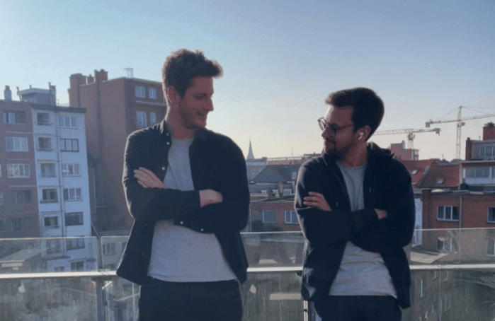
Those responsible for leading the rebranding project were Antonio Carvalho (right), UX Designer, and Cedric Geerinckx (left), Product Designer.
We’re not gonna lie: this project took longer than we expected. But we wanted to make it right and leave no room for mistakes.
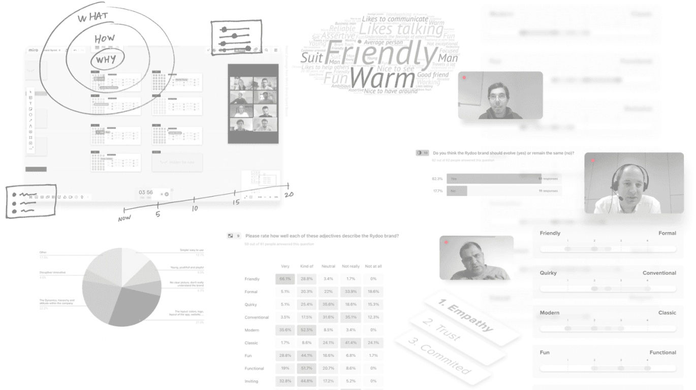
Phase one was about talking to our stakeholders. Since 2021 we have interviewed around 10 customers, 5 ex-customers and surveyed more than 70 employees to discover how they perceived Rydoo, where they wanted the brand to be, and what was lacking.
Visit our brand portal to know more
Phase two was about analysing the data collected and clustering them into 4 action points:
#1 – Brand values & tone of voice – Basically, understand how we portray ourselves to the world and how we feel as a company.
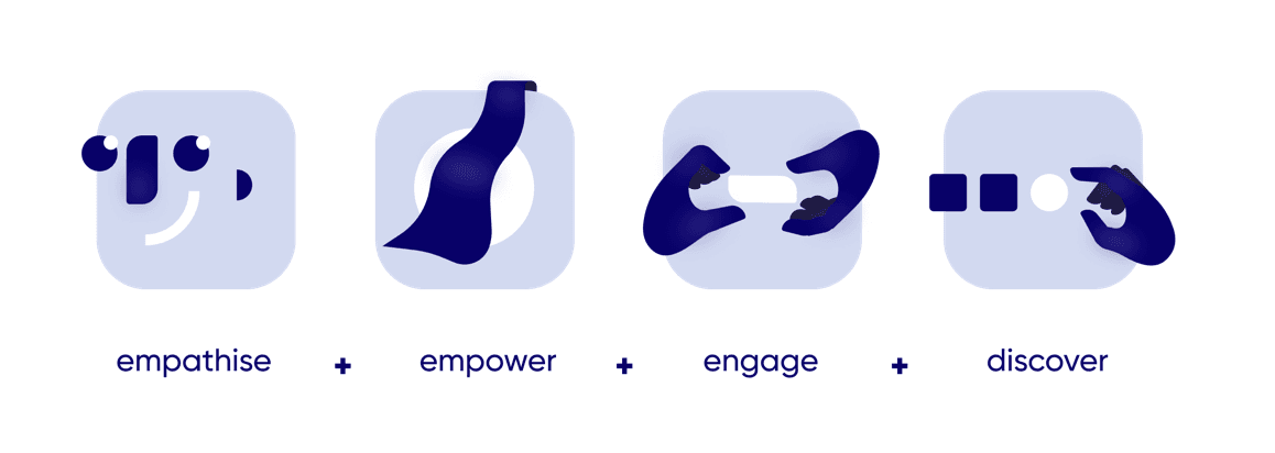
#2 – Mission and vision statements – The goal is to make our purpose crystal clear across all teams and departments
MISSION: To make spend management the easiest part of your work
VISION: Less Admin, more Impact. Create a better and more efficient future for modern organisations.
#3 – Look & feel – Literally what we look like
As said by most, “The brand lacks excitement”
#4 – Brand personality – what shines through in our touchpoints with customers
We’re a modern, fun, functional, friendly, warm, and inviting SaaS.
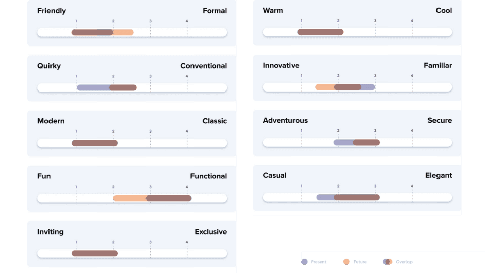
Phase three was the creative part: how can we sum all of that into a new identity?
Luckily Rydoo has two big creatives in-house, Antonio and Cedric, who together with the help of other teammates came up with our brand new identity.
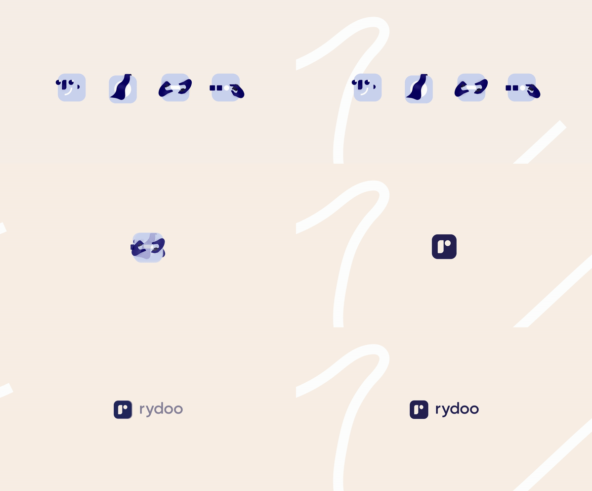
Our previous logo had multiple colours, making it harder to use. With a simpler colour palette, a bold-solid look, and organic shapes, we believe our new identity is a better representation of our personality, whilst more cohesive, modern, and inviting.
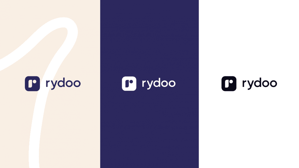
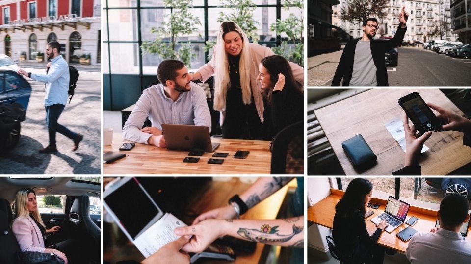
Not only has the logo changed, but the colour palette was also reduced and there was a switch from illustrations to real pictures. About that, Cedric, Product Designer at Rydoo says:
“We switched to photography instead of illustrations to reflect more on the everyday lives of modern workers and show empathy towards their daily challenges. Also, we went for a simpler design to our logo – a clean connection to the simplicity of our app. The decision to reduce the colour palette in our product is to focus more on accessibility and clarity.”
If you want to discover all the ins and outs, visit our brand new brand centre (sorry) and learn more details about the long winding road to a new brand.